
Responsive Design Company: Top 5 Essential Insights 2024
When you search for a responsive design company, you’re looking for experts who can ensure your website looks and performs beautifully on devices of all sizes—from a smartphone to a desktop. Here’s what you need to know in a nutshell:
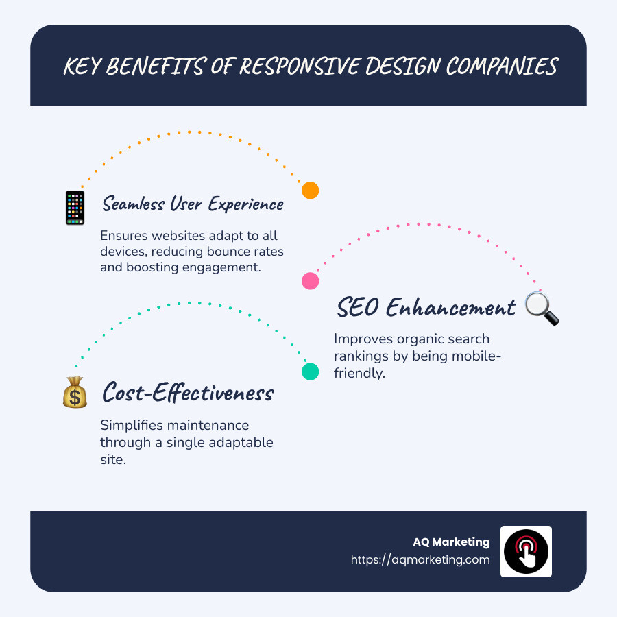
- Importance: Ensures your website adapts to any device, providing a seamless user experience.
- User Experience: Reduces bounce rates and can increase engagement.
- SEO Benefits: Improves your organic search rankings by being mobile-friendly.
- Cost-Effectiveness: Simplifies maintenance through a single adaptable site.
Responsive web design is crucial in today’s digital world, where more and more users are browsing on mobile devices. By focusing on fluid grids, media queries, and flexible images, this design approach has evolved to meet the demands of consumers who expect consistent and sleek interactions across various screens.
I’m Robert P. Dickey, with over two decades of experience in digital marketing and web design. My focus on responsive design companies ensures businesses can thrive online. Let’s explore how this approach can transform your digital presence.
Simple guide to responsive design company:
– mobile web design company
– responsive web design agency
– responsive web design services
What is Responsive Web Design?
Responsive web design is a method that ensures your website adapts seamlessly to different screen sizes and devices. Think of it like water taking the shape of any container it’s poured into. This flexibility is achieved through a combination of techniques and principles that work together to provide an optimal viewing experience.
Fluid Grids
Fluid grids form the backbone of responsive design. They allow your website layout to resize proportionally, rather than using fixed pixel-based dimensions. Imagine a grid that stretches and shrinks to fit any screen, ensuring that all elements maintain their intended layout. This flexibility is key to making sure your content looks great, whether viewed on a tiny phone screen or a large desktop monitor.
Flexible Images
Images are a crucial part of web design, but they can be tricky when it comes to different screen sizes. Flexible images adjust themselves to fit within their containing elements. This means that an image will resize to fit the screen without losing its quality or aspect ratio. The goal is to prevent images from breaking the layout or causing awkward scrolling.
Media Queries
Media queries are like the magic behind the scenes. They allow designers to apply different styles based on the device’s characteristics, such as screen width, height, or orientation. For example, a media query can ensure that a website’s navigation menu changes from a horizontal layout on a desktop to a vertical dropdown on a mobile device. This adaptability makes sure your site is always user-friendly.
Ethan Marcotte
The term “responsive web design” was popularized by Ethan Marcotte in 2010. He introduced the concept in an article that highlighted the need for websites to adapt to the growing variety of devices. Marcotte’s work laid the foundation for what has become a standard practice in web design today.
Responsive web design is not just a trend; it’s a necessity. With the increasing use of mobile internet, having a website that adapts to all devices is essential for any business aiming to succeed online. By employing fluid grids, flexible images, and media queries, you ensure your site is both beautiful and functional, no matter how it’s accessed.
Why Choose a Responsive Design Company?
Choosing a responsive design company can revolutionize your online presence. Here’s why it’s a smart move:
User Experience
A positive user experience is crucial. Imagine visiting a site on your phone and struggling to read tiny text or steer through oversized buttons. Frustrating, right? Responsive design eliminates these issues by ensuring your site looks and works great on any device.
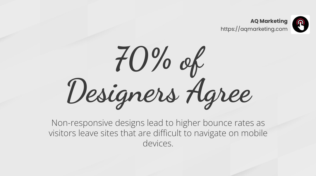
More than 70% of designers agree that non-responsive designs cause visitors to leave a site.
SEO Benefits
Search engines like Google prioritize mobile-friendly websites. This means that a responsive site can boost your search rankings. With a single URL and consistent content across all devices, search engines can easily index your site. This streamlined approach improves your visibility in search results, driving more traffic to your business.
Cost-Effectiveness
Maintaining separate desktop and mobile websites can be expensive. With responsive design, you only need one site that works everywhere. This reduces development and maintenance costs while ensuring a consistent brand image. It’s a cost-effective solution that saves time and resources.
Future-Proofing
Technology evolves quickly. New devices with varying screen sizes are constantly hitting the market. Responsive design prepares your website for the future. By adapting to different devices, you won’t need to overhaul your site every time a new gadget is released. This adaptability saves you from costly redesigns and keeps your site looking fresh and modern.
In summary, partnering with a responsive design company improves user experience, boosts SEO, saves money, and prepares your website for future challenges. It’s a strategic investment that pays off in the long run.
Core Features of Top Responsive Design Companies
When choosing a responsive design company, it’s crucial to understand the core features that set the best apart from the rest. These features ensure your website is adaptable, user-friendly, and ready for any device. Let’s explore what you should look for:
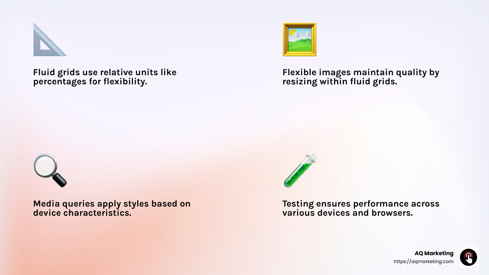
Fluid Grids
Fluid grids are the backbone of responsive design. Unlike fixed grids that use set pixel measurements, fluid grids use relative units like percentages. This allows your website layout to adjust smoothly across different screen sizes.
Imagine your website as a liquid that fills any container it’s poured into. This flexibility ensures your content looks great whether viewed on a smartphone, tablet, or desktop.
Flexible Images
Images can make or break a website’s design. Flexible images are crucial because they resize within the fluid grid, maintaining their quality and proportions.
No more cut-off images or slow load times due to oversized files. Techniques like using CSS to set a max-width of 100% ensure images scale appropriately, enhancing user experience and page speed.
Media Queries
Media queries are CSS techniques that apply styles based on device characteristics, such as screen width. They allow designers to create different layouts for different devices.
Think of media queries as the traffic cops of web design, directing your website’s style to fit each device perfectly. This ensures that your site is not only functional but also visually appealing on any screen.
Testing
Testing is a non-negotiable step in responsive design. It involves checking your website’s performance across various devices and browsers. Tools like BrowserStack can simulate how your site looks and functions on different platforms.
Testing is like taking your car for a spin before a long road trip. It ensures everything runs smoothly, preventing any unpleasant surprises for your users.
Launch
Finally, the launch phase is where all the hard work comes together. A top responsive design company will handle the launch process, ensuring your site goes live without a hitch.
Launching your website is like opening the doors to a new store. It’s essential that everything is in place for a seamless user experience from day one.
By focusing on these core features—fluid grids, flexible images, media queries, thorough testing, and a smooth launch—top responsive design companies deliver websites that are adaptable and user-friendly, setting the stage for online success.
Evaluating Responsive Design Companies
Choosing the right responsive design company is a critical step for any business looking to improve its online presence. Here’s how you can evaluate potential partners:
Portfolio Review
Start by examining the company’s portfolio. A strong portfolio showcases a variety of projects, demonstrating the company’s ability to handle different design challenges. Look for designs that align with your vision.
Think of the portfolio as a window into the company’s capabilities. It should reflect creativity, technical skill, and an understanding of responsive design principles like fluid grids and flexible images.
Client Testimonials
Client testimonials offer insights into the company’s reliability and customer service. Positive reviews can highlight strengths, while any recurring issues in negative reviews should be noted.
Testimonials are like word-of-mouth recommendations in the digital age. They provide a glimpse into the client experience and can help you gauge satisfaction and trustworthiness.
Industry Experience
Consider the company’s industry experience. A firm with a history of working in your industry may better understand your specific needs and challenges. They can offer custom solutions that a newcomer might overlook.
Experience is invaluable. It often translates to a smoother project execution, as the company is likely familiar with common pitfalls and best practices.
Technical Expertise
Finally, assess the company’s technical expertise. This includes their proficiency in using modern web technologies and tools. They should be adept at implementing responsive design elements like media queries and conducting thorough testing across devices.
Technical expertise is the backbone of a successful responsive design. It ensures your website not only looks good but functions seamlessly across all platforms.
By carefully evaluating these aspects—portfolio, client testimonials, industry experience, and technical expertise—you can select a responsive design company that aligns with your goals and sets you on the path to online success.
How Responsive Design Improves Business Performance
Responsive design isn’t just about making your website look good on different devices. It’s a powerful tool that can significantly boost your business performance. Let’s explore how:
SEO Improvement
Responsive design plays a crucial role in improving your website’s search engine optimization (SEO). Google prioritizes mobile-friendly websites in search results, meaning a responsive site can help you rank higher. This is essential because over 90% of online experiences begin with a search engine. By having a responsive design, you’re more likely to be found by potential customers.
User Engagement
A responsive website improves user engagement by providing a seamless experience across all devices. Users form an opinion about a site in just 0.5 seconds. If your site loads quickly and functions smoothly, visitors are more likely to stay and explore. This reduced bounce rate means users are spending more time on your site, increasing the chances of conversion.
Conversion Rates
Responsive design can lead to higher conversion rates. With a consistent and user-friendly experience, visitors are more likely to complete desired actions, such as making a purchase or signing up for a newsletter. In fact, 72% of marketers agree that a fluid website design increases conversion rates. This consistency across devices ensures that users can easily steer and interact with your site, no matter what device they’re using.
Brand Consistency
Maintaining brand consistency across all digital platforms is vital. A mobile-friendly website reflects your commitment to professionalism and user-centric design. It helps in building trust and credibility among visitors. With consistent branding, you can increase your sales by 33%, as users are more likely to engage with a brand they recognize and trust.
In summary, a responsive design not only optimizes your website for search engines but also improves user engagement, boosts conversion rates, and ensures brand consistency. These factors collectively contribute to a stronger online presence and improved business performance.
Frequently Asked Questions about Responsive Design Companies
What Makes a Web Design “Responsive”?
A responsive design adapts to the screen size and orientation of the device being used. It ensures that users have an optimal viewing experience, whether they’re on a smartphone, tablet, or desktop computer. This is achieved through the use of fluid grids, flexible images, and media queries.
Fluid grids allow the layout of a website to adjust proportionally based on the screen size. Flexible images scale within the confines of their containing elements, ensuring they don’t overflow or look distorted. Media queries apply different styles based on the device’s characteristics, such as its width and height.
Ethan Marcotte, a pioneer of responsive web design, emphasized the importance of designing for the ever-changing landscape of devices. By doing so, a responsive design company can create websites that are future-proof and user-friendly.
How Does Responsive Design Affect SEO?
Responsive design significantly impacts SEO by enhancing user experience and improving search engine rankings. Google prioritizes mobile-friendly websites, making responsive design a crucial factor in SEO strategy. When a website is responsive, it uses a single URL across all devices. This consolidates the site’s link equity and simplifies the analytics process, boosting SEO performance.
Moreover, a responsive design ensures faster load times, which is vital for retaining users. Since 40% of users abandon a site that takes more than three seconds to load, a responsive design helps reduce bounce rates and increase dwell time. These factors contribute to higher search engine rankings, making it easier for potential customers to find your business.
What is the Cost Range for Responsive Design Services?
The cost of responsive design services varies widely, typically ranging from $2,500 to $20,000. This range depends on several factors, including the complexity of the design, the number of pages, and the level of customization required.
Hosting and domain name fees are additional costs to consider. Hosting providers like WPEngine, GoDaddy, and InMotion offer various pricing plans, while domain names usually require an annual payment.
When evaluating a responsive design company, clearly define your budget and project scope. This ensures that the company can work within your financial parameters while delivering a website that meets your specific needs and goals.
Responsive design offers a cost-effective solution for businesses looking to maintain a single website that functions seamlessly across all devices. Investing in a responsive design company can save money in the long term by eliminating the need to redesign or maintain multiple websites for different devices.
Conclusion
Responsive design is not just a trend; it’s a necessity for businesses aiming to thrive in the digital world. By investing in a responsive design company, businesses can ensure their websites are accessible, functional, and visually appealing on any device. This adaptability leads to better user experiences, increased engagement, and improved SEO performance.
Long-Term Benefits
Responsive design offers numerous long-term benefits. First, it improves user satisfaction by providing a seamless browsing experience. This can lead to higher conversion rates as users are more likely to engage with a site that functions well on their device. Second, it boosts your SEO efforts. A single, responsive website is easier for search engines to crawl and index, which can improve your search rankings. Lastly, it is cost-effective. Instead of managing multiple versions of a website, you maintain one that works across all devices, saving both time and resources.
AQ Marketing: Your Partner in Success
At AQ Marketing, we specialize in creating responsive WordPress websites that help small to medium-sized businesses achieve their digital goals. Our team understands the importance of a mobile-friendly site and uses cutting-edge techniques to ensure your website is both beautiful and functional. With our focus on long-term, impactful results, we are committed to delivering websites that not only look great but also perform exceptionally well in search engines.
If you’re ready to take your online presence to the next level, consider partnering with AQ Marketing. Our expertise in responsive design will give your business the competitive edge it needs. Learn more about our responsive WordPress website design services.
Responsive design is a smart investment for any business looking to future-proof its online presence. By choosing a reliable partner like AQ Marketing, you can rest assured your website will meet the demands of today’s digital landscape and beyond.
