
Mobile friendly business websites: 5 Essential Tips
Why Mobile-First Design is Essential for Your Business Success
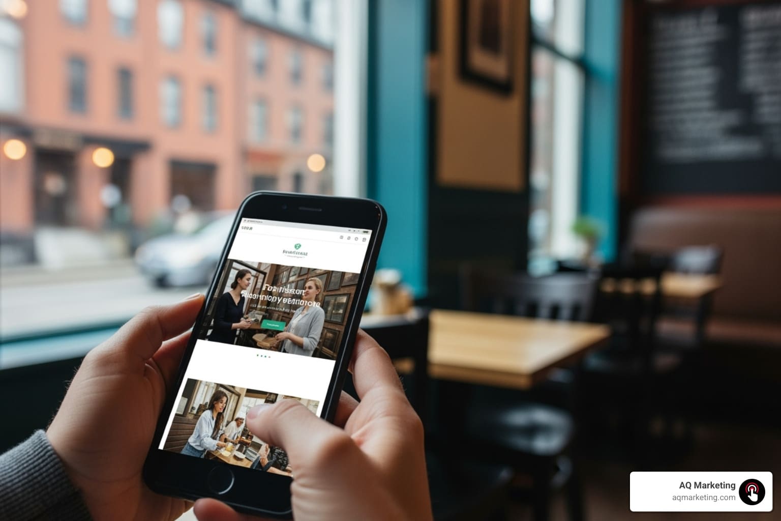
Mobile friendly business websites are no longer optional—they’re essential for survival. With 57% of all website traffic now coming from mobile devices, your business’s first impression is most likely happening on a smartphone. For local businesses in Boston, Woburn, and the Merrimack Valley, this mobile shift is even more critical.
A truly mobile-friendly website features:
- Responsive design that adapts to any screen
- Fast loading speeds (under 3 seconds)
- Large, touch-friendly buttons
- Easy-to-read text without zooming
- Simple, streamlined navigation
- Click-to-call functionality for immediate contact
When potential customers search for services on their phones, your website has seconds to impress. Google’s mobile-first indexing prioritizes sites that offer a seamless mobile experience, directly impacting your search rankings. A clunky mobile site doesn’t just frustrate visitors; it sends them to your competitors.
I’m Robert P. Dickey, and for over 20 years, I’ve helped New England businesses create effective digital marketing strategies. At AQ Marketing, we specialize in developing mobile-first websites that transform a struggling online presence into a lead-generating powerhouse.

Why a Mobile-First Approach is Non-Negotiable for Your Business
Picture this: a potential customer in Woburn has a flooded basement. They grab their phone to search for help. Your website pops up, but it’s slow, the text is tiny, and the call button is impossible to tap. They’re gone—calling your competitor instead.
This scenario plays out daily across Boston and Middlesex County. With nearly 57% of website traffic coming from mobile devices, having a fast, easy-to-use mobile site is essential for survival. While desktop e-commerce sites convert at 3.81%, mobile sites lag at 2.03%. This gap isn’t because people won’t buy on mobile; it’s because many businesses haven’t optimized the experience. Getting ahead of this curve means capturing customers your competitors are losing.
For local businesses in the Merrimack Valley and Essex County, mobile optimization is even more critical. Searches like “emergency plumber near me” happen on phones, and users choose whoever makes it easiest to get in touch.
The Impact of Google’s Mobile-First Indexing
Google’s mobile-first indexing means your mobile site is what Google primarily uses to rank you in search results. If your mobile site is slow, missing content, or hard to steer, Google sees that as your “real” website, and your rankings will suffer. Google’s own mobile-first indexing best practices confirm that mobile optimization directly impacts search visibility.
I’ve seen Boston-area businesses lose significant traffic because their mobile sites weren’t up to par. Conversely, companies that invest in a truly mobile-optimized website often see their rankings improve. There’s a strong connection between web design and SEO, and mobile is at the heart of it. Ignoring this can mean disappearing from the search results that matter most, handing customers in competitive markets like Southern New Hampshire directly to your rivals.
Enhancing User Engagement and Building Trust
Beyond SEO, a well-optimized mobile experience builds trust. When a visitor’s mobile experience is seamless—fast pages, intuitive navigation, an easy-to-find phone number—you make a powerful first impression. A frustrating mobile site causes visitors to “bounce” away, creating a lost opportunity.
When you get it right, your bounce rates drop, visitors spend more time on your site, and they begin to see your business as professional and trustworthy. For a service business in Middlesex County, this trust can be the deciding factor. Businesses that prioritize mobile user experience see more engaged visitors and, ultimately, more conversions. Understanding how website UX impacts conversions is crucial for growth.
Your mobile experience is your marketing strategy. Get it right, and the results will follow.
The Essential Elements of Mobile-Friendly Business Websites
Creating mobile-friendly sites isn’t about shrinking your desktop site. It’s about reimagining the user experience for someone on the go, perhaps looking for a local service on their phone in downtown Boston.

At AQ Marketing, our responsive website design services focus on creating a mobile site that’s like a well-organized toolbox, with everything a customer needs at their fingertips. Responsive design is the foundation, ensuring your site automatically adjusts its layout to look perfect on any device, from a desktop monitor to an iPhone. But that’s just the start. Key elements include lightning-fast loading speeds (under three seconds), clear, readable text without zooming, and touch-friendly buttons that are easy to tap.
Crafting Thumb-Friendly Navigation
Most people browse their phones one-handed, using their thumbs to steer. This is why mobile design must be thumb-friendly. Hamburger menus (the three-line icon) are standard because they keep navigation tidy. Sticky navigation keeps important links, like your phone number or a “Get a Quote” button, visible as users scroll.
Smart design places key buttons in the thumb zone—the lower half of the screen where thumbs naturally rest. For a home service business in Essex County, this means putting your primary call-to-action where it’s easiest to reach. We also ensure large tap targets (at least 48 pixels) to prevent frustrating mis-taps, even for someone wearing gloves in a New Hampshire winter. The key is to keep mobile menus simple and focused on the essentials: Services, About, and Contact.
The Critical Role of Website Speed
Nothing kills a mobile experience faster than a slow website. Mobile users are impatient; if your site takes too long to load for someone in the Merrimack Valley, they’ll move on to the next search result. Website speed directly impacts your Google rankings through Core Web Vitals, which measure loading performance, stability, and responsiveness.
The biggest speed killers are oversized images and bloated code. We address this with image optimization (compressing files and using modern formats like WebP) and code minification. We also use browser caching, which stores parts of your site on a visitor’s device for near-instant loading on return visits. As detailed in our guide on 7 Ways to Improve Website Speed and Boost Conversions, these improvements can transform your mobile experience.
How to Optimize Your Mobile Site for Conversions
Your website is your hardest-working sales tool. For a mobile user in downtown Boston, every element must guide them toward action, whether it’s calling your business or filling out a form. Mobile-first websites excel at removing every barrier between interest and conversion by making everything ridiculously easy.
Mobile users want clear call-to-action buttons, simplified forms, and click-to-call functionality that connects them to you instantly. If your site is clunky or confusing, they’ll bounce to a competitor.

Designing High-Impact Mobile CTAs
Your call-to-action (CTA) buttons are where conversions happen. On mobile, they need to be impossible to miss. Size and placement are critical; a CTA should be large enough to tap easily and positioned in the natural thumb zone. Contrasting colors help your CTA stand out, drawing the user’s eye.
Use action-oriented language instead of boring phrases like “Submit.” Try “Get My Free Estimate” or “Call for Same-Day Service.” For a home service business in Middlesex County, “Fix My Problem Today” is urgent and specific. It’s also vital to A/B test different button colors, text, and positions to see what your audience responds to. This thoughtful approach is central to our custom website design philosophy.
Optimizing Images and Videos for Mobile
Visuals can make or break your mobile site. Done right, they engage visitors; done wrong, they create a slow-loading nightmare. File compression is key, shrinking image and video sizes without sacrificing quality. We use next-generation formats like WebP, which offer better quality at smaller file sizes than JPEGs or PNGs.
Vertical video is ideal for mobile, as it fills the screen naturally. We also implement lazy loading, which loads media only as a user scrolls down the page. This ensures your page appears instantly, with content loading smoothly as needed. A local restaurant in the Merrimack Valley could use a compressed photo and a short vertical video to showcase a dish, making it look appetizing without slowing down the site.
Ensuring Your Website is Accessible to All
Truly mobile friendly business websites are designed for everyone, including people with disabilities. Accessibility is about reaching every potential customer. This starts with font size and contrast—text must be readable without zooming, with high contrast against the background. Alt text for images helps screen readers describe visuals to users with visual impairments and also boosts your SEO.
Your site must also support keyboard navigation for users with assistive technologies. Behind-the-scenes ARIA labels provide additional context for screen readers. Ensuring accessibility means that everyone, from a user in a Boston office to someone in a quiet Southern New Hampshire neighborhood, can become your customer. At AQ Marketing, we build inclusive digital experiences with our web accessibility solutions.
Common Mistakes to Avoid and Future-Proofing Your Design
After two decades of helping businesses across Woburn, Boston, and New England build better websites, I’ve seen the same mobile design mistakes repeatedly. The good news? They are completely avoidable.
 and a clean, easy-to-steer mobile website on the right (DO), set against a backdrop of a New England town square - mobile friendly business websites")
The biggest mobile killers include:
- Intrusive pop-ups: Nothing frustrates a mobile user faster than a pop-up that covers the entire screen, especially when they’re in a hurry.
- Tiny fonts and links: If visitors have to pinch and zoom to read your content or struggle to tap the right button, they’ll leave.
- Non-responsive designs: Your site must adapt seamlessly to every screen size. Google punishes sites that don’t.
- Complex navigation: A user in Essex County needing a contractor shouldn’t have to dig through five menu levels to find your services page.
- Slow loading times: Heavy images and bloated code remain the ultimate conversion killer. We cover more of these in our guide on 5 Website Design Mistakes to Avoid.
Looking ahead, mobile experiences are evolving. Voice search optimization is crucial as more people ask Siri or Google Assistant to “find plumbers near me.” AI personalization will create smarter websites that adapt to each visitor’s behavior. Progressive Web Apps (PWAs) are also on the rise, combining the best of websites and mobile apps to offer lightning-fast, app-like experiences without a download. The fundamentals, however, remain constant: a fast, simple, user-focused design wins every time.
Frequently Asked Questions about Mobile-Friendly Websites
When I talk with business owners across Boston and Woburn, these questions about mobile websites come up again and again. Here are some straight answers to help your business thrive online.
What is the difference between a mobile-friendly and a responsive website?
This can be confusing. In the past, a “mobile-friendly” site was often a separate, stripped-down version (like m.yoursite.com), which was a nightmare to maintain. Today’s gold standard is responsive design. This means you have one smart website that automatically reshapes itself to fit any screen. Whether someone is on a laptop in Middlesex County or a phone in Boston, they get the same great content, perfectly formatted. This is what we mean by modern mobile friendly business websites.
How can I test if my website is mobile-friendly?
Start by visiting your own website on your phone. Can you read the text easily? Are the buttons easy to tap? Does it load quickly? If you’re frustrated, your customers will be too. For a technical check, use Google’s Mobile-Friendly Test Tool. It’s free, accurate, and will identify specific issues. Most web browsers also have built-in developer tools that let you simulate how your site looks on different devices.
Does having a mobile-friendly website help my local SEO?
Absolutely! For local businesses in the Merrimack Valley and Southern New Hampshire, it’s essential. When someone in Woburn searches for “best pizza delivery” or “emergency plumber,” they’re almost certainly on their phone and need help now. Google knows this and heavily favors mobile-friendly sites in local search results.
A great mobile site makes it effortless for local customers to find your phone number (with click-to-call), get directions, and contact you. For a service business in Essex County, this seamless experience is often what turns a searcher into a customer. It’s not just about being found; it’s about making it easy for people to choose you.
Let’s Build Your Mobile-First Future
The digital landscape has permanently shifted. Mobile friendly business websites are the foundation of modern business success. With 57% of web traffic on mobile and Google’s mobile-first indexing determining your visibility, a thumb-friendly, fast-loading, and accessible design is essential.
For businesses throughout Boston, Woburn, and the greater Merrimack Valley, the opportunity is clear. Your customers in Essex County and Southern New Hampshire are searching for your services on their phones. Your mobile site has seconds to capture their attention and earn their business. The businesses that thrive are leading with a mobile-first approach that builds trust and drives conversions.
At AQ Marketing, we’ve helped countless local businesses—from home service providers in Middlesex County to insurance agencies across the region—transform their digital presence since 2003. We design experiences that feel natural, helpful, and trustworthy because we understand how your customers use their devices.
Your website should work as hard as you do, converting browsers into customers and turning mobile searches into real business growth. Ready to give your business the mobile-first advantage it deserves?
Get a quote for your website design and development project today, and let’s build your mobile-first future together.