
Why Your Insurance Landing Page Design Determines Whether You Win or Lose the Lead
Good insurance landing page design can be the difference between a visitor becoming a paying customer — or clicking away to a competitor in seconds.
Here’s a quick overview of what makes an effective insurance landing page:
| Element | Why It Matters |
|---|---|
| Clear headline | Grabs attention and communicates value instantly |
| Trust signals | Reviews, ratings, and affiliations build credibility fast |
| Simple quote form | Reduces friction and increases completions |
| Strong CTA | Guides visitors toward one clear next step |
| Mobile responsiveness | Most searchers are on phones — your page must work there |
| Persuasive copy | Addresses fears and answers questions without jargon |
Insurance is a product that nearly everyone needs — but almost no one wants to think about. That tension makes marketing it genuinely hard.
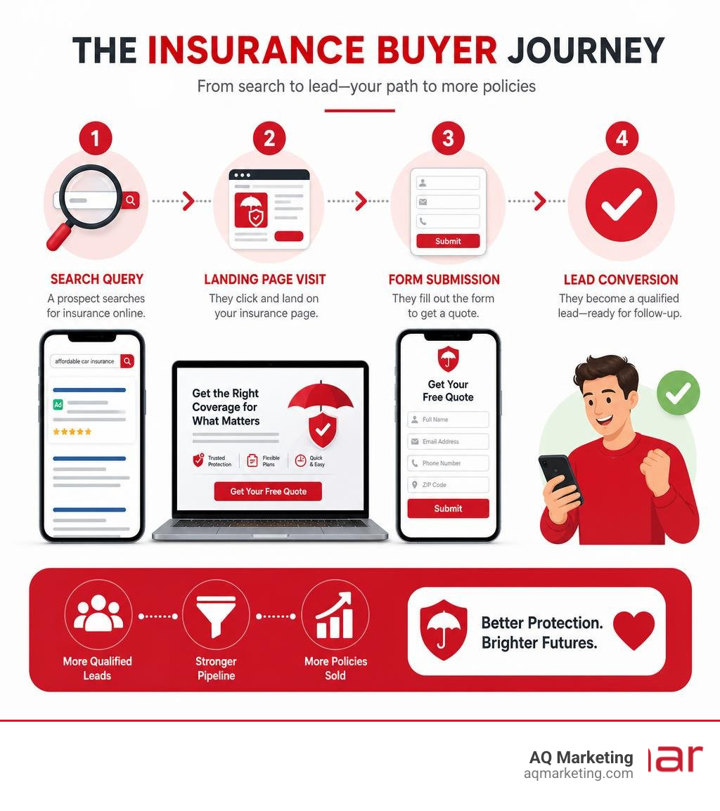
Consider this: 69% of all insurance purchases begin with a simple online search. That means your landing page is often the very first interaction a prospect has with your brand. If it doesn’t build trust quickly and make it easy to take action, that visitor is gone.
And trust matters enormously in this space. Research shows that three of the top five factors that build consumer trust are reputation, reviews, and recommendations — all of which need to be visible on your landing page before a visitor even considers filling out a form.
Getting this right isn’t just about aesthetics. It’s about understanding the psychology of someone who is anxious, comparison-shopping, and looking for reassurance — all at once.
I’m Robert P. Dickey, President and CEO of AQ Marketing, Inc., and with over 20 years of experience helping small and mid-sized businesses build high-performing digital presences, I’ve seen how strategic insurance landing page design can transform online traffic into qualified leads. In this guide, I’ll walk you through exactly what it takes to build a page that earns trust, reduces friction, and converts.
Easy insurance landing page design glossary:
What Makes Insurance Landing Page Design Unique?
Designing a landing page for an insurance agency is fundamentally different from designing a standard corporate website or a retail e-commerce page. When someone visits a retail site, they are often looking for immediate gratification. When they visit an insurance landing page, they are looking for protection, security, and peace of mind. They are dealing with complex, often confusing policies, and they are preparing for worst-case scenarios.
Because of this emotional undertone, insurance landing pages must balance high-intent search traffic with an experience that minimizes anxiety. Visitors arriving from search engines are often looking to solve a specific problem—whether they just bought a home in Newton, started a business in Worcester, or need auto coverage in Boston. They want answers quickly, but they also want to know that the company they are dealing with is legitimate, stable, and empathetic.
Unlike general corporate websites that encourage exploration through multi-level menus, an effective insurance landing page has a single, focused goal: converting that visitor into a qualified lead. This means removing distractions and guiding the user through a structured narrative. As we discuss in our analysis of The Shifting Sands: What’s Hot in Insurance Marketing?, the modern insurance consumer expects a highly personalized, streamlined digital experience that respects their time and addresses their specific risks immediately.
Core Elements of High-Converting Insurance Landing Page Design
To turn skeptical searchers into active leads, your landing page must be built on a foundation of proven conversion elements. When we analyze successful pages in the industry, we find that the top-performing designs rely on a clean layout, a compelling value proposition, and a clear path to action.
According to industry studies on 10 insurance landing page examples to generate quality leads, the most effective pages avoid overwhelming the reader. Instead, they focus on a few key components:
- Attention-Grabbing Headlines: Your headline should speak directly to the visitor’s primary need or pain point. Instead of a generic “We Sell Insurance,” use clear, benefit-driven language like “Protect Your Massachusetts Business with Tailored Liability Coverage.”
- Persuasive, Jargon-Free Copy: Insurance policies are notoriously difficult to read. Your landing page copy should do the opposite. Break down complex coverage options into simple, digestible benefits. Tell the visitor exactly what they are getting and why it matters to them.
- A Singular, Clear Value Proposition: Why should a resident of Woburn or Waltham choose your agency over a national carrier? Highlight your local expertise, your personalized service, or your ability to shop multiple carriers to find the best rates.
- Prominent Call to Action (CTA): Your CTA should be highly visible, contrasting sharply with the rest of the page design. Whether it is “Get My Free Quote” or “Check Your Coverage,” the button should look clickable and be placed strategically above the fold and repeated as the user scrolls.
Building Trust with Social Proof and Credibility Signals
Because insurance is an intangible product built on a promise to pay future claims, trust is your highest conversion lever. If visitors do not trust your brand, they will never share their personal and financial information on your quote forms. This is where social proof and credibility signals become essential.

To build immediate authority, place recognizable trust signals high on the page. This includes industry awards, professional affiliations, and security badges that reassure users their data is safe. Customer reviews and testimonials should be positioned prominently, ideally mid-page, to validate your claims.
As we emphasize in our guide on Beyond the Brochure: Essential Website Design Management for Insurance Agents, managing these trust assets is a continuous process. Showing real, local reviews from clients in Massachusetts towns like Quincy or Burlington makes your agency feel accessible and reliable. Highlighting that your reputation is backed by actual community feedback directly addresses the key trust factors consumers look for before making a purchasing decision.
Designing Frictionless Quote Forms and Interactive Tools
The quote form is where most insurance landing pages fail. Asking for too much information too quickly creates friction, causing eager prospects to abandon the page. To maximize conversions, your form design must feel easy and interactive.
One of the most effective strategies is progressive profiling, often referred to as the “breadcrumb method.” Instead of displaying a massive form with twenty fields, break the process down into short, multi-step stages. Start with low-friction questions, such as the visitor’s zip code or the type of property they want to protect. Only ask for sensitive contact information, like their email or phone number, at the very end of the sequence when they are already invested in the process.
Interactive tools can also serve as excellent low-friction entry points. For example, utilizing a Trusted Coverage Gap Landing Page Template allows you to present a simple risk assessment quiz or a coverage calculator. By letting visitors visualize their potential liability gaps or estimate their coverage needs before they fill out a formal quote request, you build value first and earn the right to ask for their contact information.
Budgeting for Professional Landing Page Development
When planning your digital marketing strategy, it is important to understand the financial investment required to build and maintain high-converting landing pages. Based on average online marketing data, professional landing page development typically ranges from $1,500 to $6,000+ per page, depending on the complexity of the design, custom integrations, and interactive elements.
Please note: This price range is based on average industry data and does not represent AQ Marketing’s actual rates.
| Development Tier | Average Cost Range | Best For |
|---|---|---|
| Basic Template Customization | $1,500 – $2,500 | Independent agents needing a fast, clean local presence |
| Custom Design & Copywriting | $2,500 – $4,500 | Agencies looking to stand out with unique local branding and optimized forms |
| Advanced Interactive Pages | $4,500 – $6,000+ | Agencies requiring custom rate calculators, multi-step quote integrations, and CRM syncing |
While templates can offer a quick starting point, a custom agency-designed landing page ensures your brand is represented accurately, your forms integrate seamlessly with your lead management systems, and your layout is optimized specifically for the local Massachusetts market.
Tailoring Layouts for Different Insurance Niches
A single, generic layout will not work for every type of insurance. The mindset of a parent shopping for life insurance is entirely different from a business owner looking for commercial auto coverage. To convert visitors at a high rate, your landing page design and messaging must be tailored to the specific niche you are targeting.

By aligning your visual cues, copywriting, and form fields with the user’s specific intent, you make the experience feel highly personalized. Let’s look at how design strategies shift across different insurance sectors.
Auto and Health Insurance Landing Page Design Best Practices
Auto and health insurance are often high-volume, highly competitive markets where consumers are frequently looking for fast, direct comparisons. Landing pages in these niches must prioritize speed, clarity, and ease of use.
For these pages, a prominent, single-field entry (like entering a zip code to start a quote) works exceptionally well above the fold. Dual calls-to-action can also be highly effective here—allowing new prospects to start a quote while giving existing policyholders a clear path to log in, which keeps your main conversion funnel clean.
Using interactive tools, such as the layout ideas found in the Travel Insurance Landing Page Template | Sidebar Quiz, can keep users engaged. A persistent sidebar or a sticky bottom bar that updates coverage details as the user answers simple questions keeps the value proposition visible at all times, preventing drop-offs during the quoting process.
Life and Commercial Liability Insurance Landing Page Design Strategies
Life and commercial liability insurance involve long-term planning, higher financial stakes, and a deeper level of trust. Visitors looking for these products are rarely impulse buyers; they require education, detailed explanations, and reassurance.
The design for these niches should feature authoritative typography, professional imagery, and comprehensive content sections that explain coverage limits clearly. Rather than rushing the visitor to a “Buy Now” button, focus on guiding them to schedule a consultation or download an educational resource, such as a coverage checklist.
For commercial lines, a structured, data-driven layout works best. Utilizing clean comparison tables, detailed FAQ accordions, and clear visual structures—similar to the design patterns in the Spectra – Photorealistic Insurance Landing Page Template | Build Fully Functional Applications with Rocket—helps business owners compare policy options side-by-side. This layout style treats the visitor as a professional buyer, presenting the facts they need to make an informed, confident decision.
Mobile Responsiveness and Performance Optimization
In 2026, mobile optimization is no longer optional. The vast majority of local searches for insurance agencies occur on mobile devices. If your landing page takes too long to load on a smartphone, or if your quote form is impossible to navigate with a thumb, you are actively losing business to more responsive competitors.
A mobile-first design approach ensures that your page layout scales beautifully on any screen size. This means using large, easily tap-able buttons, simplifying navigation menus, and ensuring that form fields are large enough to fill out easily on a phone.
Page speed is also a critical ranking and conversion factor. A delay of even a few seconds can cause a massive drop in conversion rates. To keep your pages running fast, compress your images, minimize heavy scripts, and utilize clean coding practices. As we explore in The Ultimate Guide to Growing an Insurance Business in a Tough Market, maintaining a fast, reliable mobile experience is one of the most effective ways to lower your cost-per-lead and outperform larger, slower national competitors.
Common Mistakes to Avoid in Insurance Web Design
When designing insurance landing pages, it is easy to fall into common design traps that quietly drain your marketing budget. By recognizing and avoiding these mistakes, you can instantly improve your user experience and conversion rates.
- Using Too Much Industry Jargon: Avoid using dense, policy-heavy language on your landing pages. Keep your copy simple, clear, and focused on the real-world benefits of the coverage.
- High-Commitment Calls to Action: Asking a first-time visitor to “Buy Now” or “Apply Online” can feel too aggressive. Instead, use lower-commitment phrases like “Get a Free Quote” or “Check Your Rates.”
- Cluttered Layouts and Distracting Navigation: A landing page is not a homepage. Remove your standard header navigation links, social media feeds, and external blog links. Every link that does not lead to your quote form is an exit ramp off your conversion highway.
- Ignoring Local Trust Signals: If you are an agency serving Massachusetts communities like Cambridge, Framingham, or Woburn, make sure your local identity is clear. Using generic stock photos of generic cities makes you look like an impersonal national aggregator rather than a trusted local advisor.
A/B Testing and Continuous Conversion Rate Optimization
The launch of your insurance landing page is just the beginning. To get the absolute best return on your digital marketing investment, you must continuously test and refine your page elements based on real user data.
A/B testing allows you to compare two versions of a page to see which one performs better. For example, testing different headline variations, button colors, or form lengths can yield surprising results.
A great example of this is testing your CTA verbiage. In real-world conversion rate optimization tests, changing high-commitment buttons from “Buy Now” to lower-commitment options like “Continue” or “See My Options” has been shown to increase user progression through quote forms by over 53%. By implementing custom tracking and analyzing user behavior, you can make data-driven adjustments that continuously lower your acquisition costs. As we discuss in our article on Loyalty Unlocked: Proven Strategies for Insurance Customer Retention, building a seamless, user-friendly digital onboarding experience from the very first click is the foundation for long-term customer loyalty and retention.
Frequently Asked Questions About Insurance Landing Pages
How does insurance landing page design differ from standard corporate websites?
A standard corporate website is designed for exploration, providing comprehensive information about a company’s history, team, community involvement, and full suite of services. An insurance landing page, however, is a highly focused, single-purpose page designed to convert a visitor from a specific marketing campaign into a lead. It eliminates external navigation links, distractions, and unnecessary content to guide the user toward a single action: requesting a quote or scheduling a consultation.
What is the breadcrumb method in insurance form design?
The breadcrumb method (or multi-step form) is a design technique that breaks down a long, intimidating form into smaller, logical steps. Instead of presenting a single page with dozens of input fields, the user is guided through a sequence of simple, interactive questions. This reduces visual overwhelm, lowers friction, and encourages users to complete the form because they can see their progress step-by-step.
How do trust signals impact insurance lead generation?
Because insurance is built on trust and a promise of future protection, trust signals are critical for conversions. Displaying elements like local customer reviews, industry accreditations, security badges, and professional affiliations reassures visitors that your business is reputable, secure, and established. Research shows that reputation and reviews are among the top factors that influence consumer trust online.
Partner with AQ Marketing for High-Converting Insurance Web Design
Crafting a high-converting insurance landing page requires a strategic blend of clean visual design, persuasive copywriting, intuitive user experience, and technical optimization. In a highly competitive market like Massachusetts, your digital first impression can make or break your lead generation efforts.
At AQ Marketing, we have spent over two decades helping small to medium-sized businesses in Woburn, Boston, and across Massachusetts establish a powerful, long-term online presence. We specialize in custom AQ Marketing Website Design & Development that is tailored specifically to the unique needs of local insurance agencies.
Whether you need to optimize your current website, build high-performing landing pages for your advertising campaigns, or improve your local search rankings, our team is here to deliver impactful, long-term results.
Ready to transform your online presence and start generating higher-quality insurance leads? Book a 15-minute phone call with us today to discuss your goals and explore how we can help your agency grow.