
Responsive Web Design Font Size: Top 5 Secrets Revealed
Responsive web design font size is crucial for both user experience and search engine optimization. A well-proportioned font size ensures that your website is accessible, readable, and engaging across all devices, from smartphones to widescreen desktops. The key components to achieving this include:
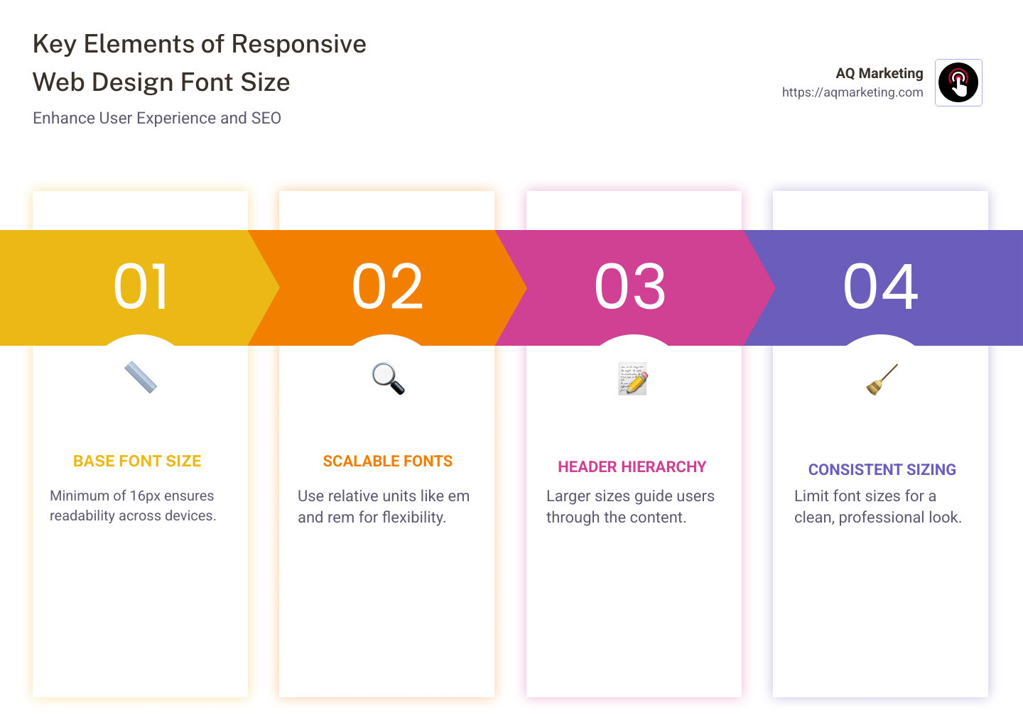
- Base Font Size: Minimum of 16px for readability, equivalent to 12pt.
- Scalable Fonts: Use of relative units like
emandremto allow flexible sizing. - Header Hierarchy: Larger sizes for headers to guide users smoothly through the content.
- Consistent Sizing: Limited font sizes across the website to maintain a clean design.
- Testing: Regular testing on various devices to ensure optimal display and functionality.
Responsive design isn’t just about aesthetics—it’s about creating a seamless, user-friendly web experience that boosts engagement and conversions.
As Robert P. Dickey, with over 20 years of experience in digital marketing and responsive web design font size strategies, I’ve helped countless businesses, especially in the Boston, MA area, to optimize their websites for better online performance. Let’s dive deeper into this essential web design element and find how it can transform your digital presence.
Responsive web design font size definitions:
– responsive design company
– responsive web design agency
– responsive web design services
Understanding Responsive Web Design Font Size
When it comes to responsive web design font size, it’s all about making sure your text is easy to read on any device. Whether someone is viewing your site on a smartphone or a large desktop monitor, the font size should adjust to provide a comfortable reading experience.
Why Legibility Matters
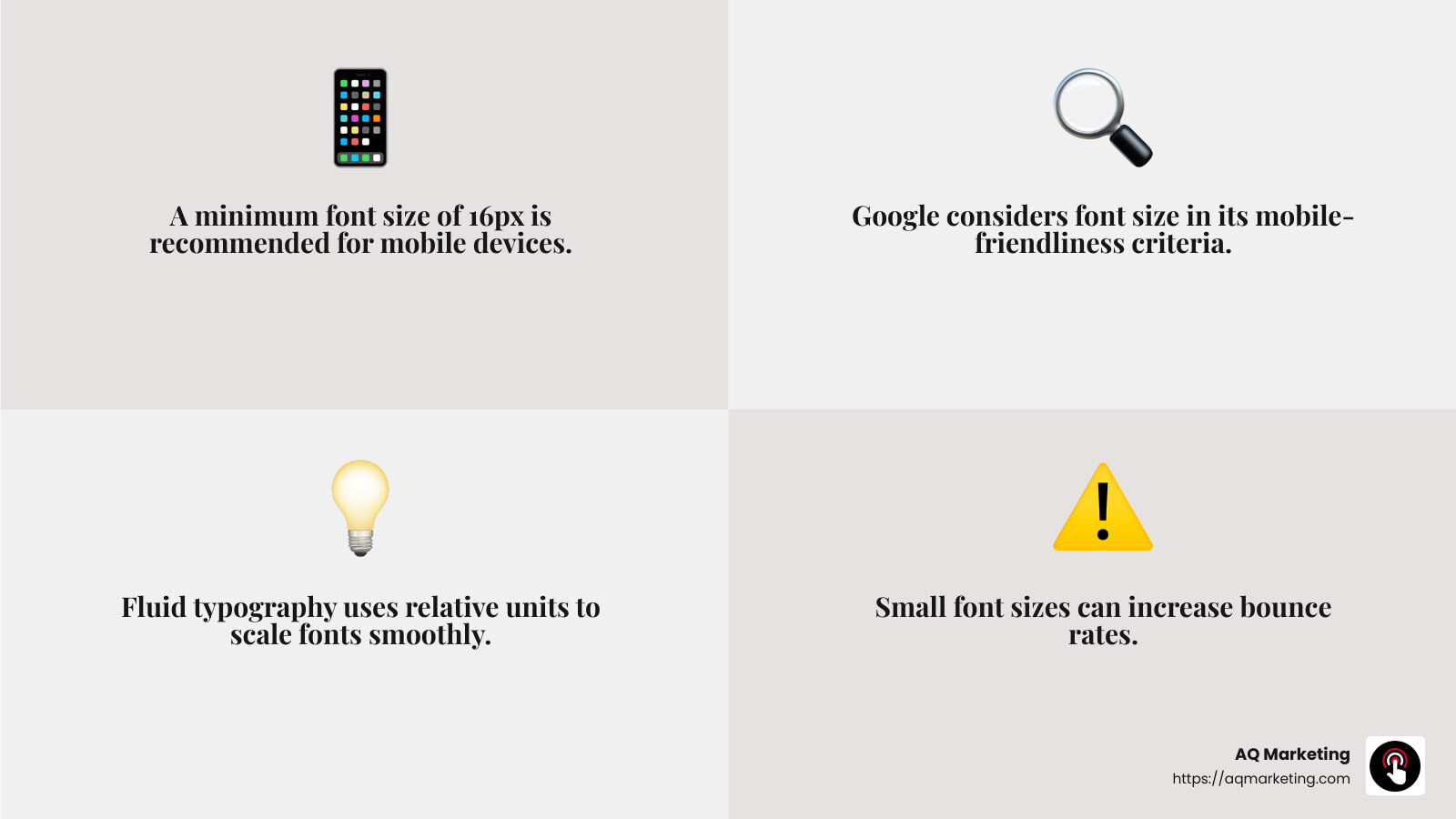
Legibility is crucial. If users can’t easily read your content, they’ll likely leave your site quickly. This can increase your bounce rate and negatively impact your site’s performance in search engines. Google even considers font size when ranking sites, as smaller fonts can make a site less mobile-friendly and harder to read.
The Mobile-Friendly Factor
On mobile devices, screen space is limited. This means your font size needs to be just right—not too small to strain the eyes, but not so large that it overwhelms the screen. The recommended minimum font size for mobile is 16px, as anything smaller can make users pinch and zoom, leading to frustration.
Strategies for Effective Font Sizing
To achieve the perfect responsive web design font size, consider these strategies:
- Fluid Typography: This technique uses percentages or viewport units to scale fonts smoothly across different screen sizes.
- Media Queries: These allow you to set specific font sizes at different breakpoints, ensuring that your text looks great on any device.
- Relative Units: Using
emorremunits makes your font sizes scalable. This means they can adapt based on the base font size set for the page, providing consistency across various devices.
By focusing on these key areas, you ensure your website is not only visually appealing but also functional and user-friendly. This approach helps in retaining visitors and improving your site’s overall performance.
We’ll explore best practices for responsive font sizing to further improve your website’s readability and accessibility.
Best Practices for Responsive Font Sizing
When designing a website, getting the responsive web design font size right is crucial. It’s not just about aesthetics; it’s about making your site accessible and easy to read for everyone, which ultimately helps your Google ranking.
Readability is Key
Readability is the heart of user experience. If users struggle to read your content, they’re likely to leave your site, leading to a higher bounce rate. A higher bounce rate can signal to Google that your site might not be providing the best user experience, potentially affecting your search ranking.
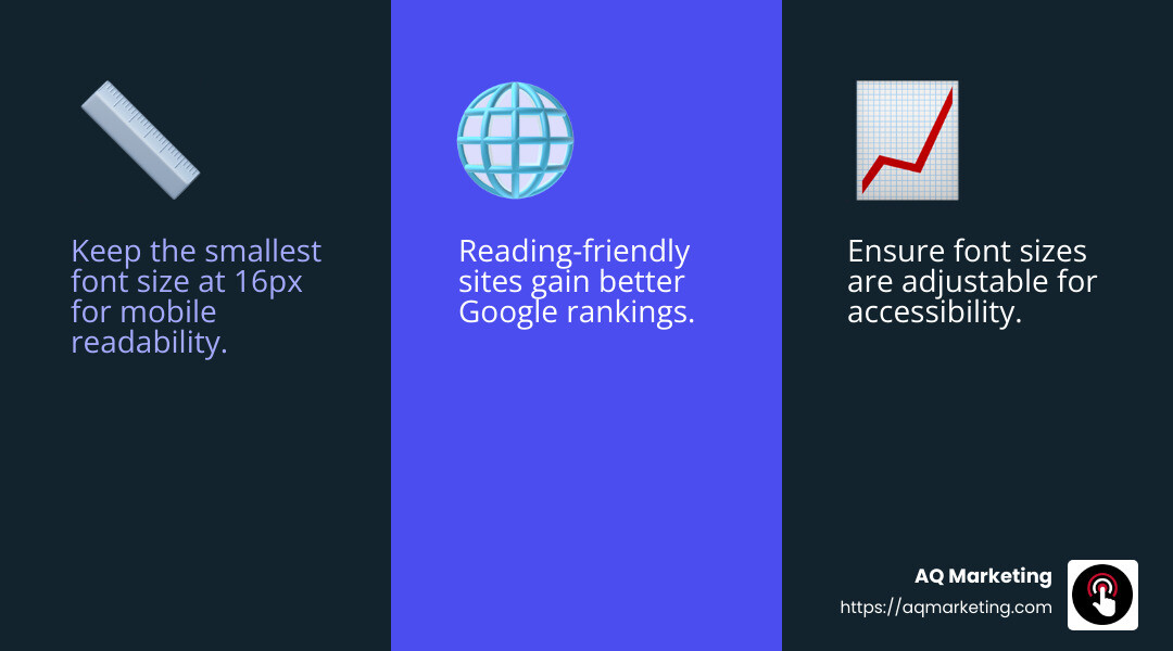
- Tip: Keep the smallest font size at 16px to ensure readability on mobile devices. This size aligns with Google’s mobile-friendly criteria, helping you avoid penalties in search results.
Accessibility Matters
Accessibility isn’t just a buzzword; it’s a necessity. Websites need to be accessible to everyone, including those with visual impairments. This means using font sizes and styles that are easy to read and understand.
- Fact: The ADA standards highlight the importance of “easy to see and hear content.” Ensuring your font sizes are adjustable and legible contributes to meeting these standards.
Boosting Your Google Ranking
Google cares about user experience, and font size plays a role in that. Sites that are easy to read and steer tend to perform better in search rankings.
- Quote: “Many search engines rank pages based on how mobile-friendly they are. Font sizes smaller than 12 px are often difficult to read on mobile devices and may require users to zoom in to display text at a comfortable reading size.”

Implementing Best Practices
To ensure your site is both readable and accessible, consider these best practices:
- Use Consistent Font Sizes: Avoid using too many different font sizes. Stick to a few sizes for headers, body text, and captions to maintain consistency.
- Test on Various Devices: Regularly test your website on different screen sizes to ensure readability and accessibility.
- Optimize for Accessibility: Use tools like Google’s Mobile-Friendly Test to ensure your site meets accessibility standards.
By following these best practices, you not only improve your site’s readability and accessibility but also improve its performance in search engines. This sets the stage for a user-friendly experience that keeps visitors engaged and boosts your site’s success.
Next, we’ll dig into the techniques for implementing responsive font sizes to perfect your website’s typography.
Techniques for Implementing Responsive Font Sizes
When it comes to perfecting your website’s typography, understanding the right techniques for implementing responsive web design font size is essential. Let’s explore some effective methods like fluid typography, media queries, and relative units.
Fluid Typography
Fluid typography adjusts the font size based on the screen width. This means your text will look great on any device, from a tiny smartwatch to a large desktop monitor. By using the calc() function in CSS, you can make your font size responsive to the viewport size.
- Example:
font-size: calc(15px + 0.390625vw);This formula increases the font size by a small percentage of the screen width, ensuring it scales smoothly across devices.
Fluid typography eliminates the need for multiple breakpoints and provides a seamless user experience.
Media Queries
Media queries are a powerful tool in CSS for making font sizes responsive. They allow you to specify different styles for different devices based on their screen size.
- Example:
css

html {

font-size: 16px;

}

@media (min-width: 768px) {

font-size: 18px;

}

@media (min-width: 1024px) {

font-size: 19px;

}
By setting breakpoints, you can ensure your text is always legible and appropriately sized, regardless of the device.
Relative Units
Using relative units like rem and em can make your font sizes more adaptable. These units are based on the root font size, allowing for consistent scaling across different elements.
- Fact:
1remis equal to the root font size, which is typically set to 16px by default. If you change the root size, all elements usingremwill adjust accordingly. - Example:
css

html {

font-size: 18px; // Sets 1rem to 18px

}

h1 {

font-size: 2rem; // 36px

}
Relative units ensure that your typography remains consistent and scalable, enhancing both readability and accessibility.
By mastering these techniques, you can create a website that not only looks great but also provides a seamless reading experience across all devices. Up next, we’ll explore common mistakes in responsive font sizing to help you avoid pitfalls and ensure your site is user-friendly.
Common Mistakes in Responsive Font Sizing
When crafting a website, it’s easy to stumble into common pitfalls with responsive web design font size. Let’s explore a few mistakes that can hinder user experience and how to avoid them.
Small Fonts
Using fonts that are too small can make your content hard to read, especially on mobile devices. Google recommends a minimum font size of 16px for body text to ensure readability. Fonts smaller than this may require users to zoom in, which can frustrate them and negatively impact your site’s SEO.
“Font sizes smaller than 12px are often difficult to read on mobile devices and may require users to zoom in to display text at a comfortable reading size.” – Google
Too Many Font Sizes
Consistency is key in design. Using too many different font sizes can create a disorganized and cluttered look. Stick to a limited number of font sizes for headings, subheadings, and body text. This not only improves readability but also maintains a clean and professional appearance.
- Tip: Use one size for body text (16px to 18px) and scale headings appropriately, such as 1.3 to 1.96 times the body size.
Lack of Testing
Failing to test your website on various devices can lead to unexpected issues with font sizing. Always check how your site appears on different screen sizes, from smartphones to large monitors. Tools like BrowserStack can help you simulate how your website looks across different devices and browsers.
- Test on different devices: Ensure your font sizes adapt well and remain legible on all screen sizes.
By avoiding these common mistakes, you can ensure your website offers a better user experience and keeps visitors engaged. Up next, we’ll tackle some frequently asked questions about responsive font sizing to clear up any lingering doubts.
Frequently Asked Questions about Responsive Font Sizing
What is the ideal font size for mobile devices?
When designing for mobile, the ideal font size is crucial for readability. Google recommends a minimum font size of 16px for body text on mobile devices. This size ensures that users can read your content without needing to zoom in. Readability is key to keeping users engaged and preventing frustration.
- Tip: Test your site on a mobile device. If you have to squint, the font size is likely too small.
How do I make font sizes responsive using CSS?
Responsive font sizing can be achieved using CSS techniques like media queries and relative units. Media queries allow you to apply different styles based on the screen size. For instance, you can increase font size on larger screens to improve readability.
Here’s a simple example:
“`css
body {
font-size: 16px;
}
@media screen and (min-width: 680px) {
body {
font-size: 18px;
}
}
@media screen and (min-width: 1224px) {
body {
font-size: 20px;
}
}
“`
- Relative units like
emorremare also helpful. They scale with the user’s settings, making your design more flexible.
Why is responsive font sizing important for SEO?
Responsive font sizing is not just about aesthetics; it’s also crucial for SEO. Google considers user experience when ranking websites. If your site is hard to read, users may leave quickly, increasing your bounce rate and potentially harming your Google ranking.
“Search engines rank pages based on how mobile-friendly they are.” – Google
By ensuring your font sizes are responsive and readable, you improve user experience and, in turn, your SEO. This makes it more likely for your site to appear higher in search results, bringing in more visitors.
Responsive font sizing is a vital part of modern web design. Up next, we’ll dive into the conclusion, summarizing the key points and how AQ Marketing can help you achieve impactful results.
Conclusion
At AQ Marketing, we understand the importance of responsive web design font size in creating a seamless user experience. Having a website that is not only aesthetically pleasing but also functional across all devices is crucial. Our team is dedicated to helping small to medium-sized businesses improve their online presence with effective digital marketing strategies.
Responsive font sizing plays a significant role in this. By ensuring that your website’s text is readable on any device, you not only improve user engagement but also boost your SEO. Google prioritizes sites that offer a great user experience, and having the right font size is a key component of that.
We specialize in delivering long-term, impactful results for our clients. Our expertise in SEO, website design, and social media management allows us to create custom solutions that meet the unique needs of your business. Whether you’re in the home services or insurance industry, we have the tools and knowledge to help you reach your target audience effectively.
Ready to make your website more responsive and user-friendly? Let AQ Marketing guide you through the process and ensure your online presence is optimized for success. Learn more about our responsive web design services and how we can help you achieve your digital marketing goals.
Together, we can create a website that not only looks great but also performs exceptionally well, driving more traffic and conversions for your business.